Andreas Fogarasi -- Georgetown


Andreas Fogarasi
Georgetown
17/09/2010 - 06/11/2010
Georgetown: this is the title of Andreas Fogarasi’s second individual exhibition at Georg Kargl and his first extensive presentation in the gallery’s main space. The title not only serves as a reference and sign of respect for the gallerist and his constant efforts in the interest of the further development of his own institution as a brand and the (further) enhancement of Freihausviertel as a site of cultural diversity and identity. Georgetown is also one of the most popular place names around the world, especially in the US, a state of affairs that is due to English colonial history and the name of the then ruling kings.
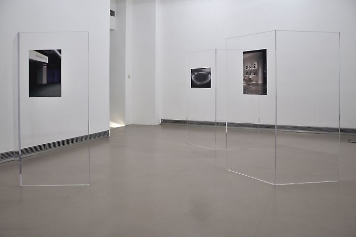
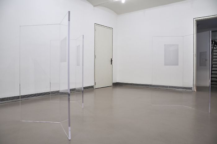
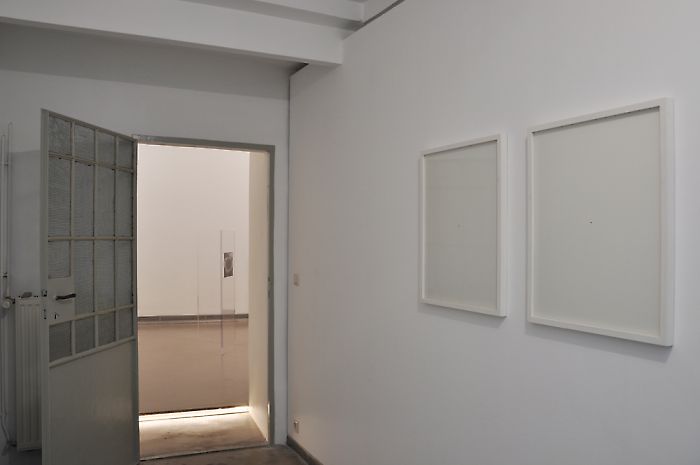
Fogarasi’s critical practice negotiates questions about the change of urban and public space, its image and our perception of it in spatial interventions, photographs, objects, or typographic explorations; the exhibition title is part of the concept. Distributed by way of diverse advertising media, printed on a sign over the entrance to the gallery, it suggests to the outside world something concealed that can be entered by walking through the three levels. Georgetown is both a presumptive claim and a critique at the same time. What strategies does a private company use to represent and market a region, a city, or an entire country, how does image formation work and what visual codes are used for it?
In his project Public Brands, which he has been working on since 2003, Fogarasi takes a look at the logos, symbols, and slogans of regions and cities that, led by strategic-economic considerations, try to distinguish themselves from one another by emphasizing unique characteristics. For example, in his videos Deutsche Städte and La France Fogarasi has the logos of German cities and French regions, which he collected in meticulous research, pass by one another in alphabetical order. He not only points out how various identities of urban and local space are communicated by instrumentalizing graphically simplified versions of architecture, historical monuments, striking landscapes, or famous personalities for self-stylization. Fogarasi homogenized the logos by formatting the unified size and the reduction to black and white, and thus presents how the concept of branding that emerged in recent decades due to the compulsion to differentiate in face of the flood of advertising went to absurd extremes. The creation of images for public and private corporations, cities, and countries was had at the cost of the complexity of the object, and left behind chimerical stencils that are not well suited to transporting complexity or contradiction, or making their source clearly identifiable.
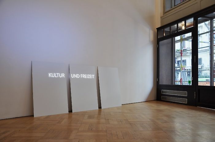
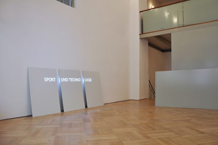
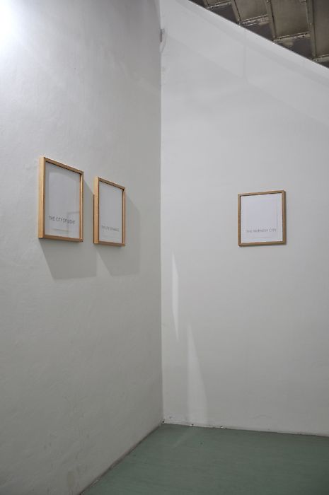
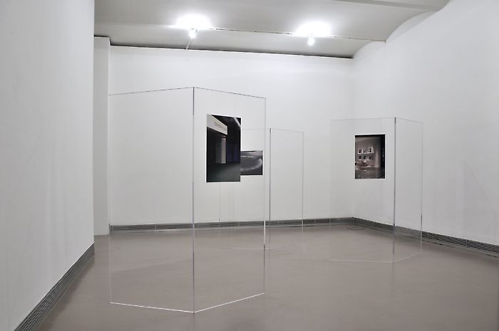
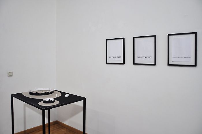
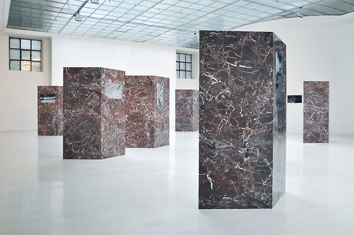
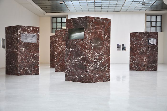
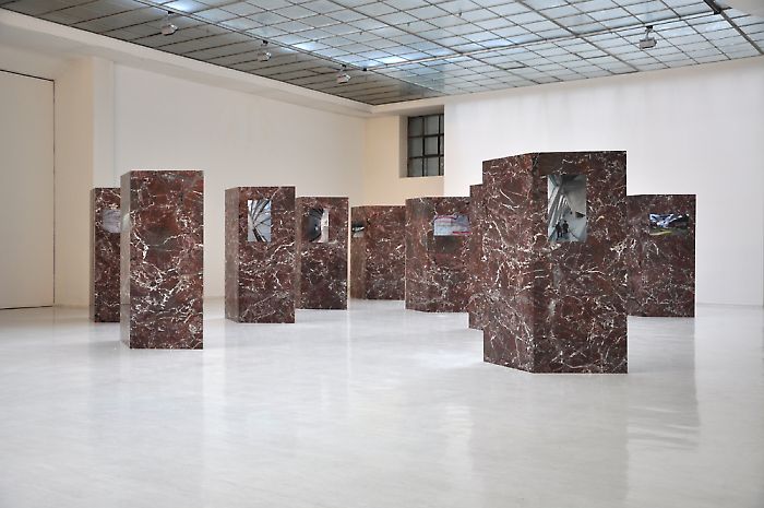
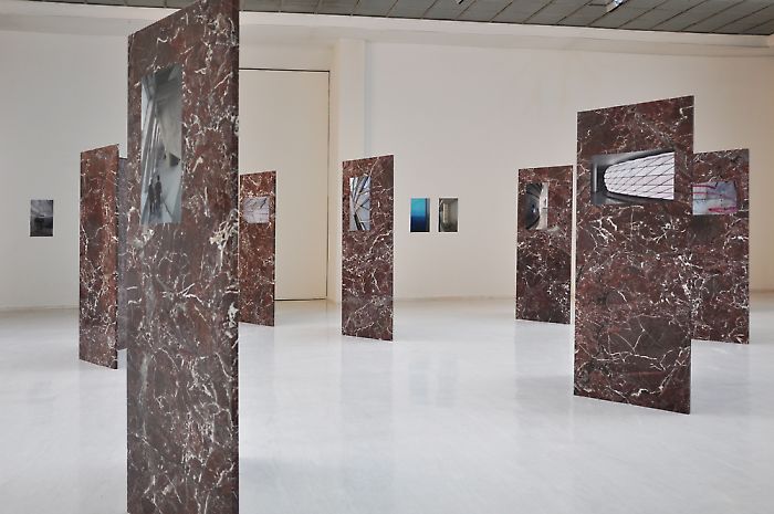
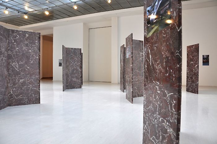
In the series of drawings Städte (Cities) Fogarasi uses typography that is always identifiable to engage with the abbreviated and condensed concepts and slogans used for cities. Die ewige Stadt (The Eternal City), Hauptstadt des 19. Jahrhunderts (Capital of the Nineteenth Century), City of Lights, City of Magic, Wine City, Beer City, Water City: the adjacency of clichés and mythologizations that generate subjective desires and in their generalization could also make clear that images are instable and transferrable. Numerous works by Andreas Fogarasi engage with the question of the role of architecture in the competition among symbols of urban status. Due to the pressure of global competition among cities, architecture is increasingly subject to a logic of economic valuation. It is used to express the will towards representation of public and private corporations and cities and due to its symbolic referential power forms their image. The installation Wise Corners consists of a series of photographs of buildings placed on ten triangular marble objects that due to their massiveness and identical direction occupy the entire skylight room of the gallery like a defensive group, providing a perceptual experience that counters the usual spatial referential system. They are sculpture, monument, display, and architectural element at the same time, referring to representational architecture in its material. The photographs affixed to the marble objects never show an overall view of the buildings, but only elements whose focus is placed on materials, on superficial structures or visual axes. Fogarasi extracts and documents details, focusing on trivialities that due to their omnipresence are often lost beneath the threshold of conscious perception, condensing them to signs where form, concept, and theme are insolvably linked and as reference bind arrangements into a dense network of association.